Challenge
The Nigerian Auto Festival needed a logo identity that could represent the excitement, innovation, and cultural relevance of Nigeria’s growing automotive community.
The festival required a visual identity that feels bold, modern, and energetic while remaining professional enough to attract sponsors, partners, exhibitors, and enthusiasts.
The challenge was to create a logo system that captures the spirit of automobiles, movement, community, and entertainment in a way that is memorable, scalable, and adaptable across digital and physical applications.
The challenge was to create a logo system that captures the spirit of automobiles, movement, community, and entertainment in a way that is memorable, scalable, and adaptable across digital and physical applications.
Solution
We developed a bold and structured identity system inspired by motion, speed, engineering, and modern automotive culture.
The direction focused on creating a logo that feels dynamic and recognizable while maintaining simplicity and versatility.
Through strategic exploration of typography, symbol structure, and visual balance, we created a logo system that communicates confidence, movement, innovation, and energy. The identity was designed to work seamlessly across event branding, merchandise, social media, print materials, and large-scale festival applications while maintaining a consistent and premium presence.
Through strategic exploration of typography, symbol structure, and visual balance, we created a logo system that communicates confidence, movement, innovation, and energy. The identity was designed to work seamlessly across event branding, merchandise, social media, print materials, and large-scale festival applications while maintaining a consistent and premium presence.

The Scope
The scope of this project focused on developing a bold and scalable visual identity for The Nigerian Auto Festival.
The process began with brand discovery and creative research to understand the festival’s vision, audience, and position within Nigeria’s growing automotive and entertainment industry.
Through logo exploration, typography selection, and color development, we created a strong identity system inspired by movement, speed, innovation, and modern automotive culture.
Every element was carefully designed to ensure the brand feels energetic, recognizable, and professional across all touchpoints.
The project also included the development of supporting brand applications and visual guidelines to ensure consistency across digital and physical platforms.
Brand mockups, merchandise applications, print assets, and event branding materials were created to demonstrate how the identity functions in real-world environments.
The final outcome was a cohesive visual system that strengthens recognition, improves brand credibility, and supports the long-term growth of The Nigerian Auto Festival.


Key Deliverables
- Brand Identity Design
- Logo System Development
- Brand Strategy & Positioning
- Typography System
- Color Palette Development
- Brand Guideline Document
- Social Media Visual Direction
- Print & Merchandise Applications
Achievements
The Nigerian Auto Festival launched with a strong and recognizable visual identity that captures the spirit of automotive culture and modern entertainment.
The new logo system established consistency across digital and physical touchpoints while helping the festival appear more credible, organized, and premium.
The identity created a visual foundation that supports future growth, audience recognition, sponsorship attraction, and long-term brand positioning within the automotive industry.
The identity created a visual foundation that supports future growth, audience recognition, sponsorship attraction, and long-term brand positioning within the automotive industry.

How We Did It
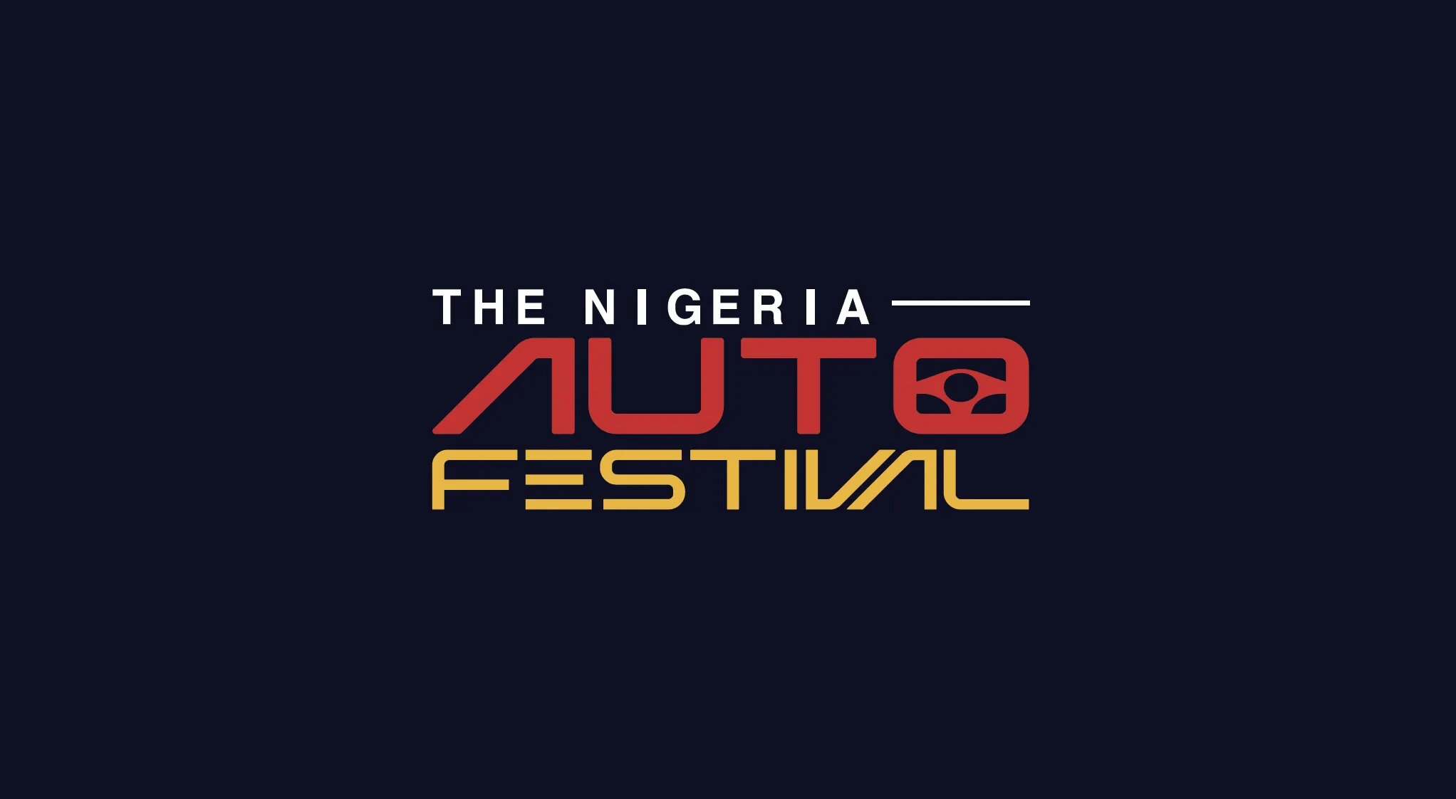
Logo Design
The logo was designed using bold structural forms inspired by movement, speed, automotive engineering, and modern event culture.
The composition creates a sense of energy and motion while maintaining balance, clarity, and versatility across different applications.
Typography
The typography system combines strong modern letterforms with clean readability to reflect confidence, innovation, and professionalism.
The type direction reinforces the energetic and premium personality of the festival while ensuring strong visual recognition.
Imagery Direction
The visual direction focuses on dynamic automotive visuals, motion-inspired compositions, performance culture, and premium event experiences.
The imagery system was developed to reinforce excitement, innovation, lifestyle, and the strong community surrounding the festival.
Achieved
- Stronger brand recognition and consistency
- A bold identity that reflects automotive culture and innovation
- Improved credibility for sponsors, partners, and exhibitors
- Versatile logo applications across digital and physical platforms