.Hilda’s Wholesome Foods.
Nourishing Brand Identity for an Organic Food Innovator
About
Hilda’s Wholesome Foods is dedicated to empowering healthy homes with every product. Born from a passion for cooking and wellbeing, Hilda’s offers 100% organic, preservative-free foods and signature spice blends that “bring healing to the body.”
Challenge
Hilda’s Wholesome Foods needed a cohesive, trustworthy brand identity that would translate beautifully across packaging, digital media, and promotional stickers—while conveying its natural, healing essence to health-conscious families and specialty retailers.
Solution
1
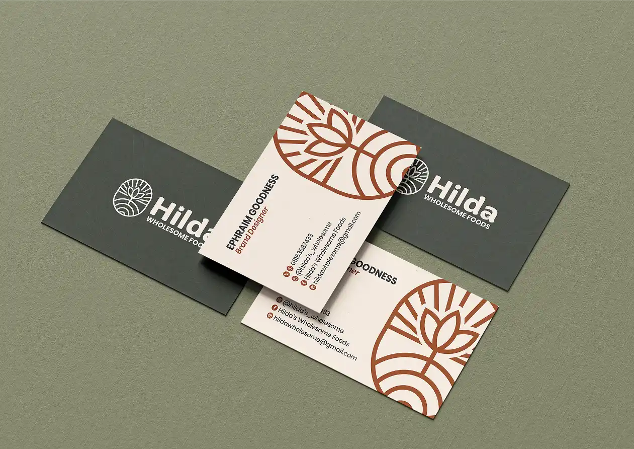
Icon + Wordmark Design: Developed a friendly, slightly rounded wordmark paired with a stylized leaf-and-spice-swirl icon that can stand alone on jars or labels.
2
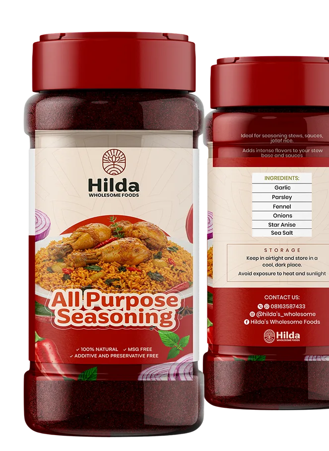
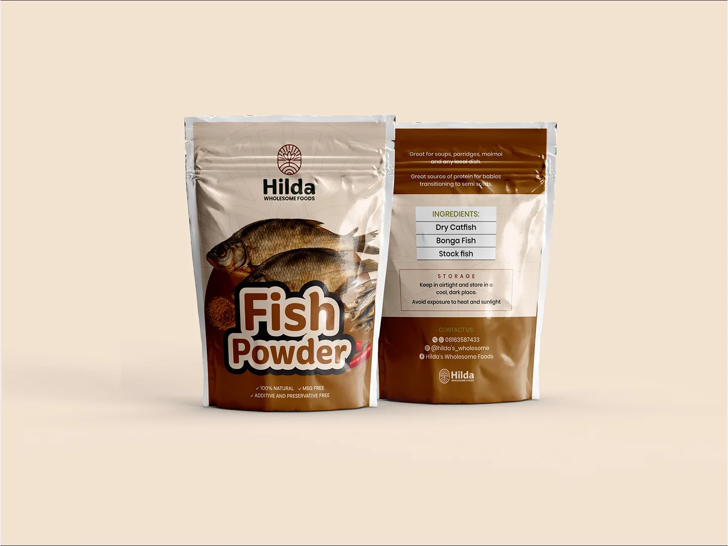
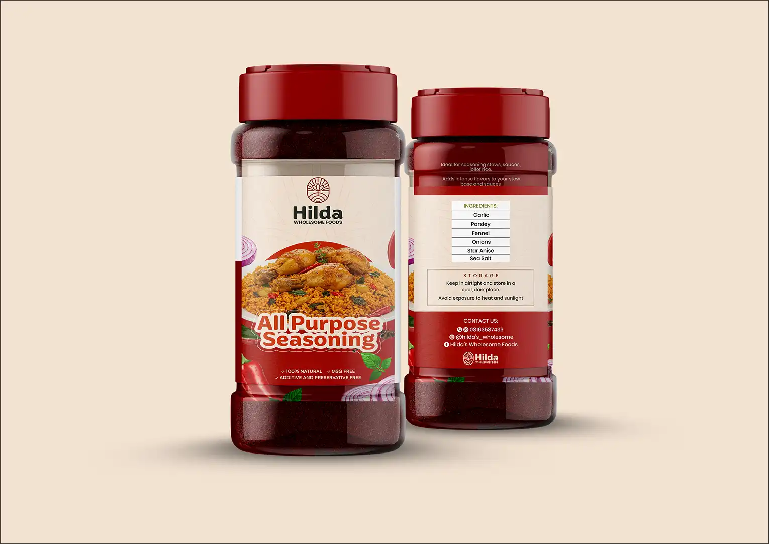
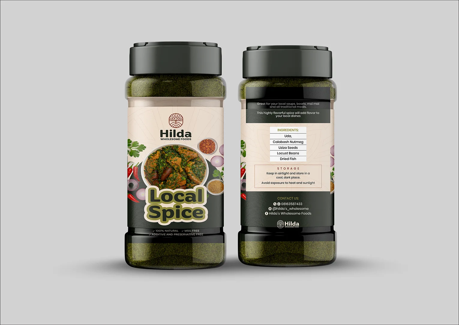
Sticker & Packaging Mockups: Designed die-cut sticker templates (“HWF” and full name) showcasing spice-jar usage and storage instructions for four core blends.
3
Mini Brand Guidelines: Compiled color specs (terracotta, olive green, muted mustard, cream), typography rules, and clear-space rules in a concise PDF for consistent application.
Project Scope
Create a timeless, adaptable brand framework—including full-color and monochrome logos, lock-ups, and packaging stickers—to support product launches and retailer display
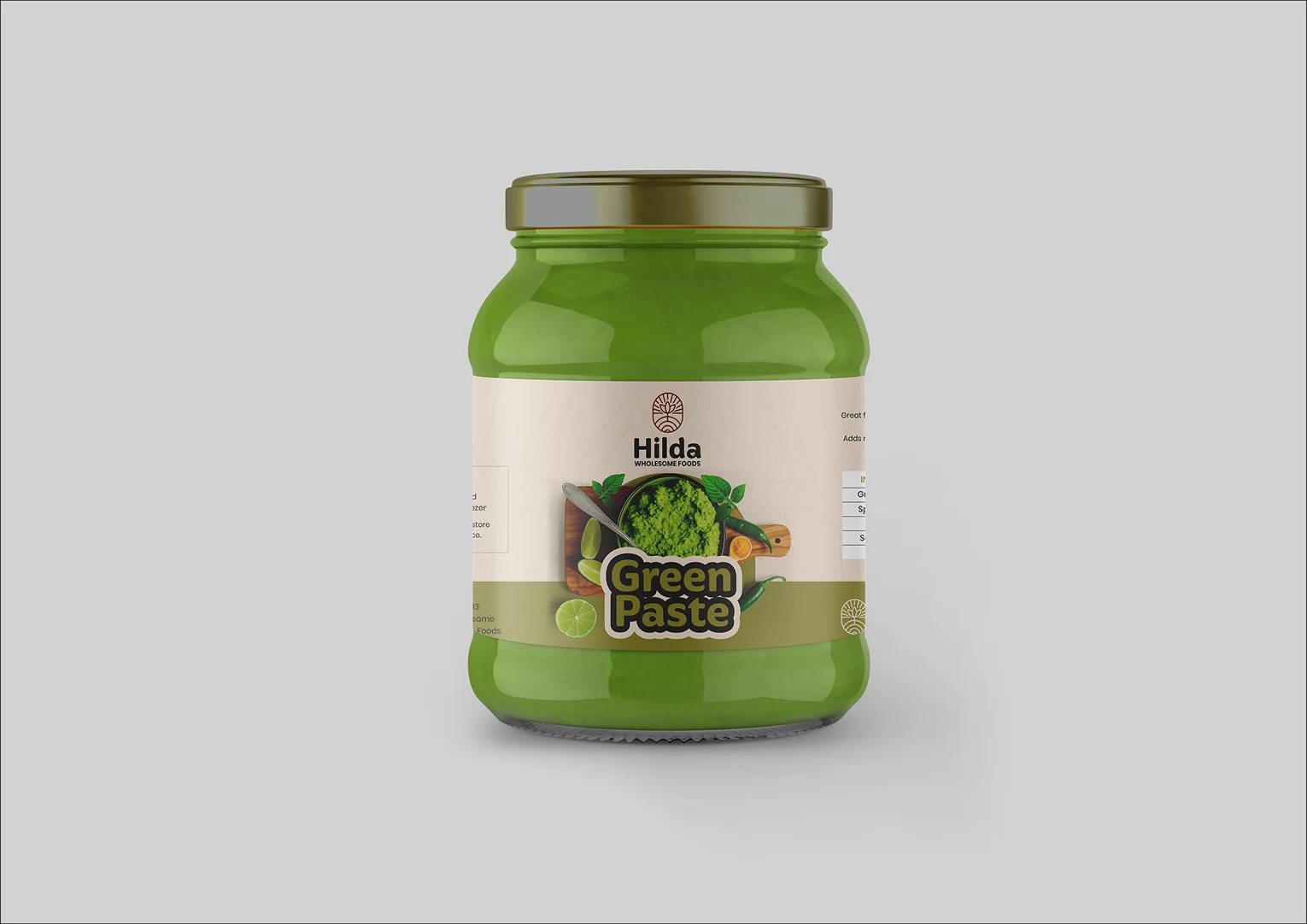
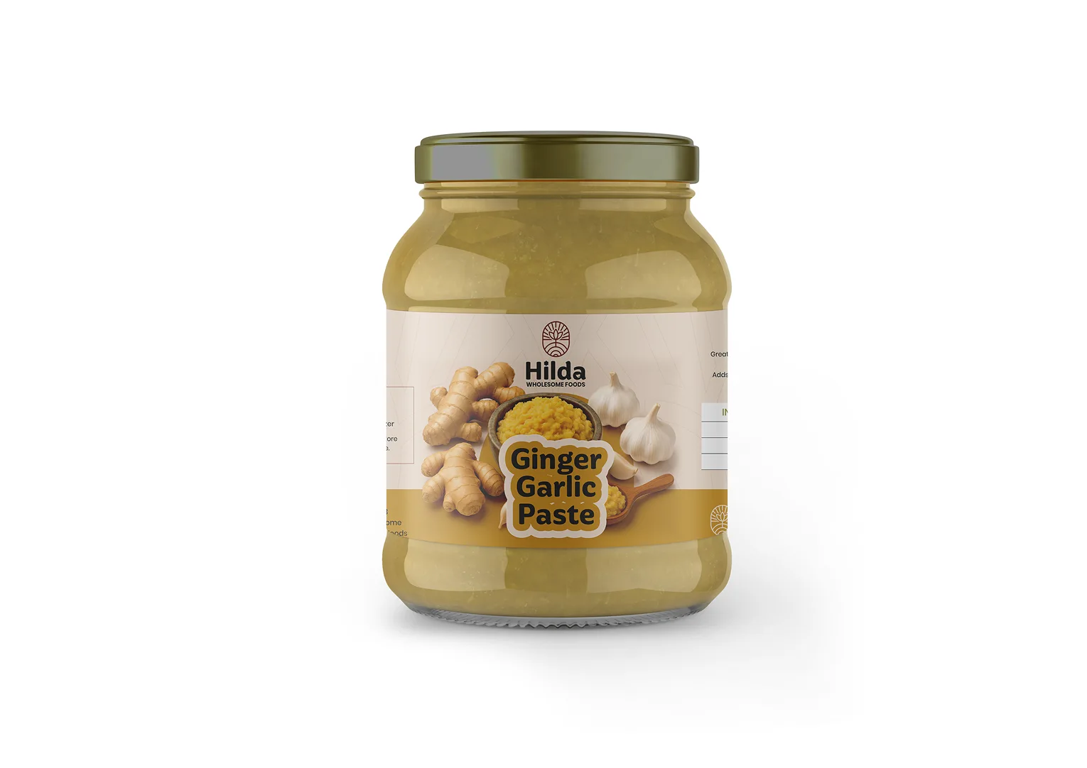
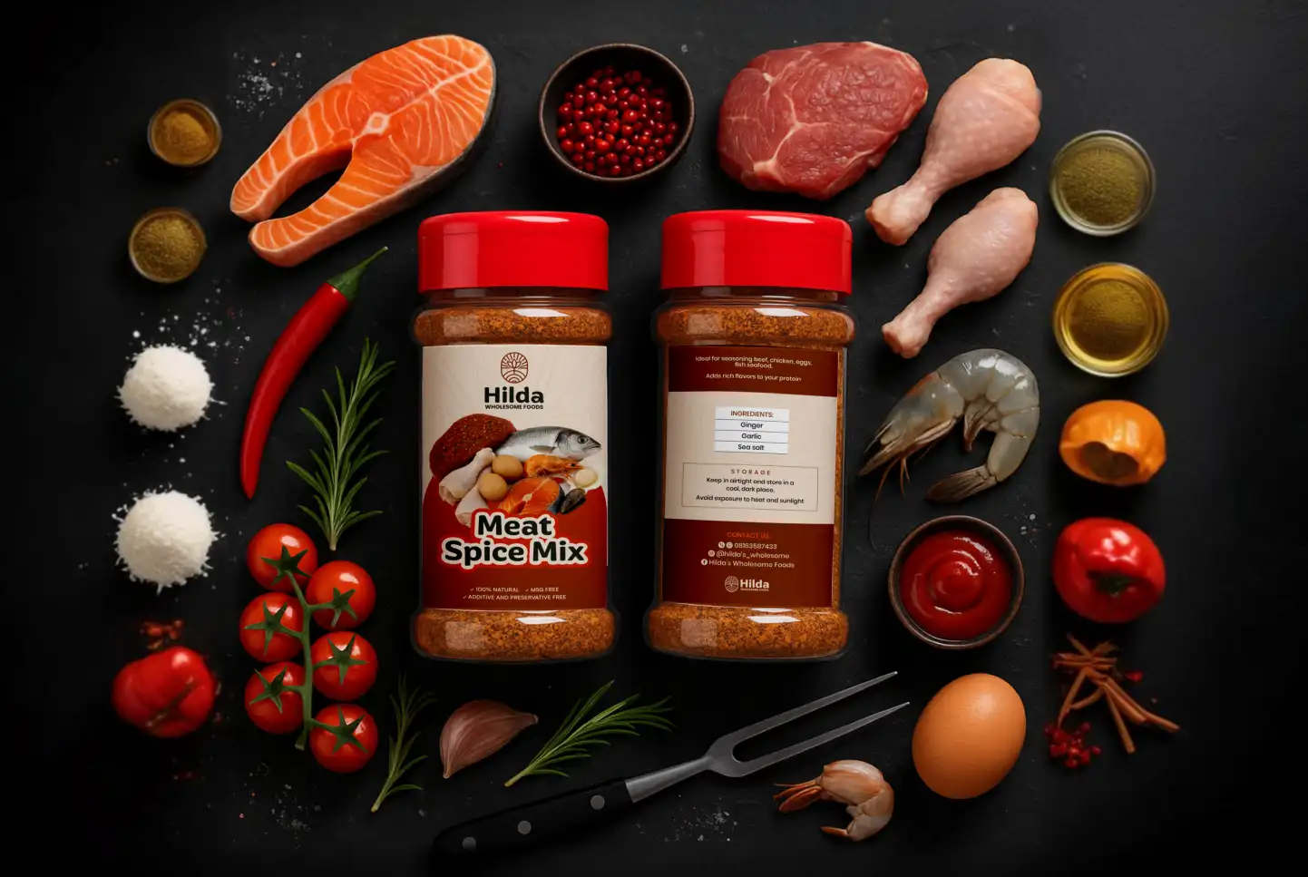
The new brand identity led to a:
30%
Increase in retailer inquiries due to enhanced shelf appeal and clear labeling
25%
Uplift in social media engagement following rollout of cohesive visual assets
Key Deliverables
- Primary Logo (Icon + Wordmark)
- Secondary Variations (Horizontal, Stacked, Monochrome)
- Icon-Only Version for jars and social avatars
- Die-Cut Sticker Designs for spice blends
- Mini Brand Guidelines PDF
Achievements
- Established a cohesive, approachable identity that resonated with Hilda’s target audience.
- Enabled clear, legible labeling on 200 g spice pouches, improving shelf appeal. Streamlined onboarding for new retailers with consistent brand assets.
- Laid the groundwork for future flavor-line expansions with modular design.
How We Did It
- Research & Moodboard: Aligned on earthy inspirations and culinary iconography to root the design in authenticity.
- Sketch-to-Digital Workflow: Iterated 4 logo concepts—refined the chosen design for clarity at small sizes.
- Sticker Mockup Creation: Applied the icon and wordmark to spice-jar and packaging templates, ensuring storage info was clear.
- Guidelines Compilation: Assembled a mini-guide PDF detailing color codes, typography, and usage rules for seamless brand rollout.
