.Edamor .Edamor .Edamor .Edamor .Edamor .Edamor .Edamor .Edamor .Edamor. | .Edamor .Edamor .Edamor .Edamor .Edamor .Edamor.
Collateral Design & Premium Print for a London Fashion Brand
About the Brand
Edamor is building its name as a distinctive fashion force in London and beyond — a brand rooted in elegance, creativity, and authenticity. With sub-brands that complement the parent identity while standing on their own, Edamor’s ambition demanded more than great clothing. It demanded a world around the clothing.
The Context
A premium fashion brand lives and dies by perception. Every touchpoint either reinforces the story or undermines it. For Edamor, the garments already carried the weight of quality and intention — but the surrounding experience did not yet match. The packaging, the tags, the unboxing — these were the first physical moments a customer would have with the brand. And those moments were undefined.
The challenge was clear: Edamor needed a collateral system that didn’t just package a product but introduced a brand. One that communicated premium positioning before a single stitch was seen.
The Unlock
The insight that shaped our approach was simple but critical — the consumer’s experience of Edamor doesn’t begin when they try on the garment. It begins the moment they see the bag, hold the box, or turn over a tag. Every one of those moments is a chance to say something about who the brand is.
We identified that Edamor’s deep purple and off-white palette carried enormous untapped potential. These weren’t just brand colours — they were signals. Purple speaks to richness, creativity, and quiet confidence. Off-white grounds it, bringing balance and a sense of considered restraint. Used intentionally across every collateral piece, these colours could do the storytelling before a single word was read.
The Craft
Our solution operated on two levels — design and production.
Design System: We built a cohesive design language across all collateral that communicated Edamor’s positioning at first glance. Each piece — from the smallest seal tag to the largest gift box — carried the same visual DNA. Brand colours were applied with intention, typography was consistent, and the design system ensured that every element felt like it belonged to the same world, even when encountered in isolation.
Print & Material Quality Design without execution is a sketch. We understood that print quality would make or break the brand story. We sourced materials that matched the premium positioning, selected specialty finishes that added tactile depth, and ran production with an obsessive focus on three things: consistent colour reproduction, durable materials, and clean prints. The goal was simple — nothing that left our hands should feel mass-produced.


Project Scope
- Collateral Design
- Fabric Sourcing
- Materials Design
- Printing
Key Deliverables
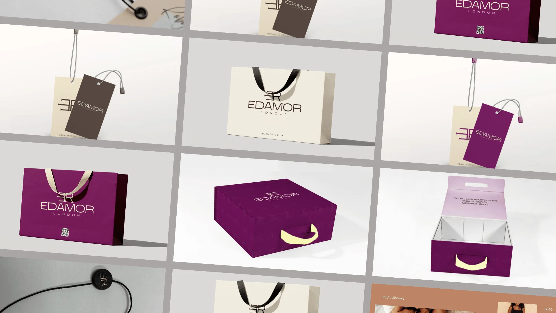
Seal Tags Small but significant. These carry the brand mark and serve as the most intimate point of contact between the garment and the customer. Specialty finishes ensure they feel considered, not commodity.
Gift Boxes Structured, branded, and built to feel like a destination in themselves. The deep purple exterior and clean interior create a moment of reveal before the product is even visible.
Gift Bags Designed to carry the brand into the street. The bag is the last thing the customer holds and the first thing the world sees — it needed to feel like an extension of the brand, not an afterthought.
Paper Tags: The functional heart of the collateral system. Product information, care details, brand story — all delivered with the same design rigour as every other piece.
The Result
We delivered branded products that met and surpassed the client’s expectations — not just in design but in the quality of execution that fashion-grade collateral demands.
The prints arrived on time — a detail that matters enormously in an industry where production delays can derail launches. Colour consistency held across every item. Materials felt considered and durable. And most importantly, the collateral spoke directly to the heart of the brand — reinforcing Edamor’s story of elegance and intentionality at every touchpoint.
The packaging no longer follows the product. It introduces it.
